New York Public Library Unveils New Logo Design

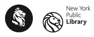
New York Public Library logos old (left) and new (right).
The New York Public Library has updated its brand identity for the digital age. The new logo, a bolder more streamlined version of a lion profile inside a circle, is designed to work both on-line and in print. The simple shapes and smooth curves, along with a new color pallet, allow the mark to be used in a variety of sizes and resolutions without losing any detail. Kievit, a new sans-serif typeface, was chosen to compliment the logo with its contemporary look. The re-design, the first in over 25 years, was done in-house by the library’s creative team, and is based on the stone lions that adorn the main library steps. “It’s primarily based on Fortitude [the northern lion], but it’s a combination of both,” explains Marc Blaustein, art director for the library system. “The angle is Fortitude, but some of the features are inspired by Patience.”
The lion statues were named Fortitude (north statue) and Patience (south statue) by city mayor Fiorello La Guardia during the Great Depression. He felt these qualities were essential to survival in those tough economic times, and were more suitable than the previous names Lord Lenox and Lady Astor (rightly so, as both lions are male). The new logo debuted just in time to mark the library’s 100th birthday. The headquarters, built on Fifth Avenue between 1899 and 1911, are currently undergoing a $1.2 billion restoration for the centennial. The campus is now one of the world’s largest libraries, coming in third after the Library of Congress and the British Library.

