Best Book Cover Designs of 2010
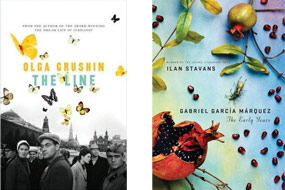
 As the final days of 2010 wind down, many websites and blogs are busy compiling their “Best of” lists for the year, including line-ups for the best in book cover design. Anis Shivani at The Huffington Post has selected 21 “cool” covers and spoken with the authors and designers to get a feel for the creative process that goes into designing a successful cover. Many of the titles selected are by lesser-known authors, but the design quality of several of the selections is top-notch. The cover created for The Line by Olga Grushin plays on the contrast of color and gray scale, positive and negative space, the austere and the lyrical to create a simple, yet intriguing cover. “Everyone immediately loved this one…A perfect cover should capture the feel of the book, and this one does so wonderfully: there is the contrast between the grim reality and the world of fantasy, hope and beauty; there are individual stories, each one unique; and I read a Nabokov reference into the butterflies, which makes me even happier,” comments Grushin.
During the creative process, a delicate balance has to be maintained between what the author desires and the demands of the editorial and marketing departments. “One of our ‘secrets’ is the degree of author input we include in the process. Sometimes it makes for a more arduous process as we invite more sets of eyes in. But I think it keeps things fresh in terms of images. Many authors have a strong visual idea for their book, and in the best instances, the image is very arresting…Although we value author input tremendously, they are not always right, and need to be steered away from certain ideas,” explains Fiona McCrae, publisher of Graywolf Press.
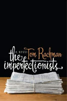
 Several other blogs like Feedgrids and Liska + Associates have singled out book covers designed for more high-profile authors as winners. Both blogs selected the cover for The Early Years by Gabriel Garcia Marquez for its beauty. The rich colors and lush imagery of pomegranate fruit, along with the spare use of type create a visually appetizing whole. Feedgrids also included the jacket art for The Imperfectionists by Tom Rachman on its list. The use of typography and negative space, draw the eye and create a stark, arresting design.
Happy New Year Everyone!

